PEPSI FLAVOURS


Turning flavour confusion into a world with personality
Brand World Exploration and Execution | 2026
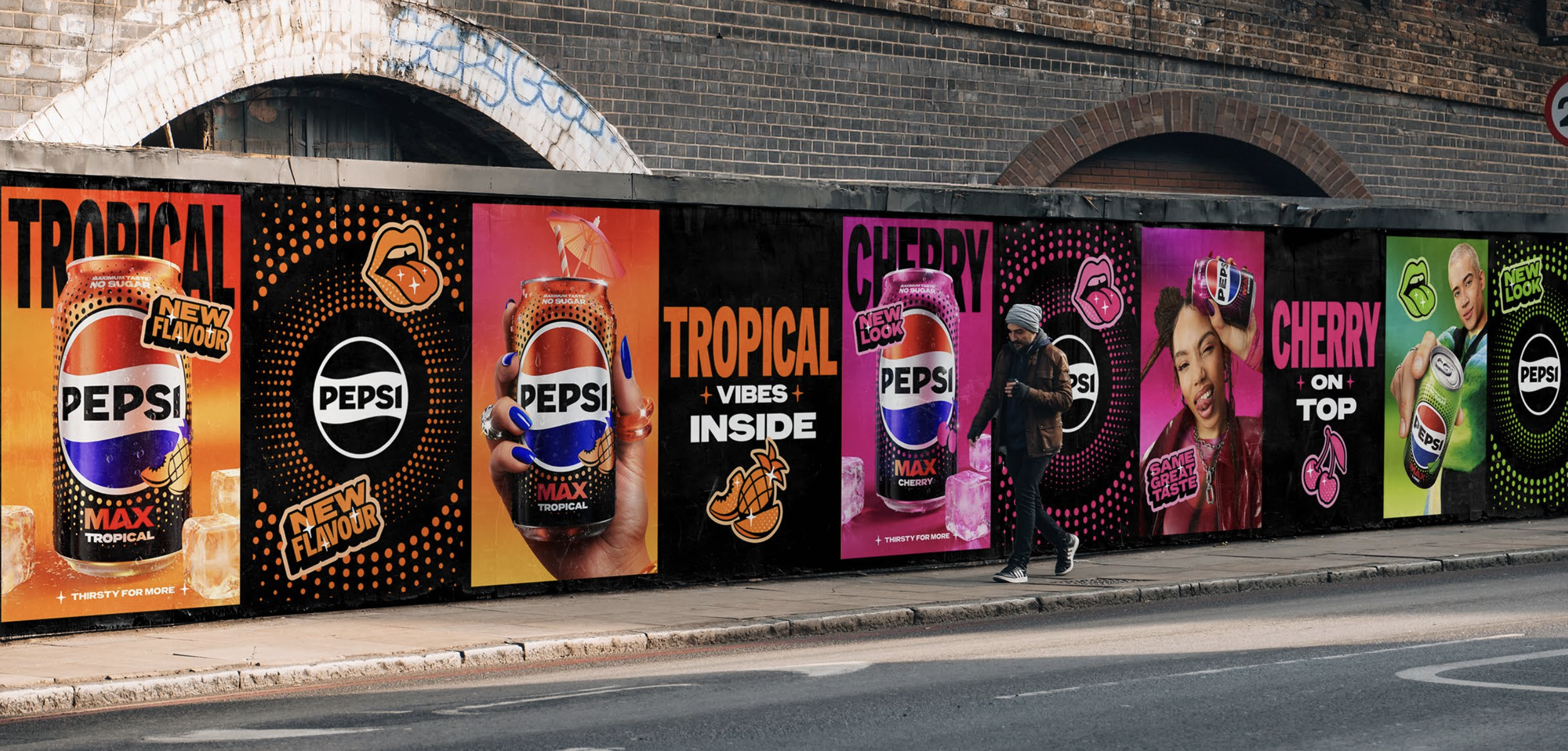
The previous UK Flavours range struggled with flavour navigation and shelf impact. One issue was that the “globe/dot” device used in place of fruit cues (due to stricter local constraints within the UK) was being read by consumers as generic “polka dots,” reducing clarity and recognition. The packaging refresh meant they needed a new Flavours world that felt unmistakably Pepsi while giving each flavour a stronger, more confident personality when stood alone.
3D Animation I created as a supporting asset internally to celebrate the can re-design.
My role
This was a large, multi-designer project with many contributors and stakeholders. As a key contributor, I supported development and execution of the Flavours campaign world by:
• Proposing and refining options for the brand world and flavour personalities
• Designing how the world would come to life across key visuals and shopper applications
• Developing the sticker illustration device design and placement decisions
• Supporting the shopper toolkit + renders approach
• Writing the motion brief and storyboard, guiding composition, transitions, sound direction and creating supporting motion assets.
• Art directing lifestyle photography, using Ai to provide sketches of props/material/lighting references and shot intent
• Developing the brand world for the new flavour, Pepsi Tropical
(Packaging was initially developed with an external partner; I supported decision-making through shelf mockups and application considerations rather than leading packaging design.)
To explore the brand world concepts at speed, we used AI software such as Gemini, Chat GPT, Weavy, Higgsfield and Midjourney to help convey the concepts with the intent to work into the chosen route with more precision.
Brand World Explore
Concept 1 | Bold Flavour Burst
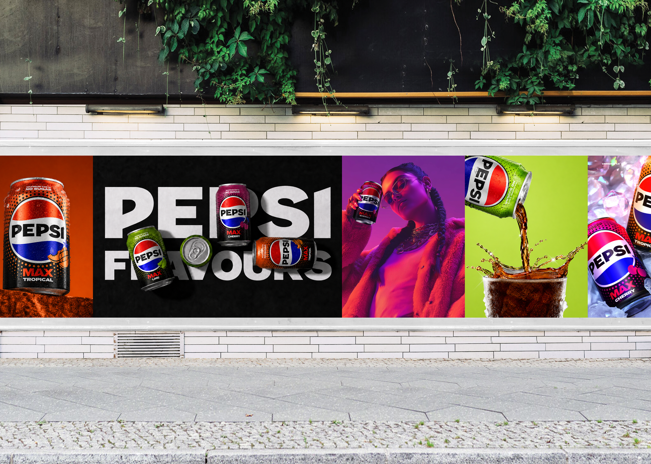
Sticking closely to the core Pepsi visual standards, this route focuses on bold colour executions to convey flavour. It uses powerful and dynamic angles, lifestyle shots to hit personality cues and heros the cans as the main character in every visual.
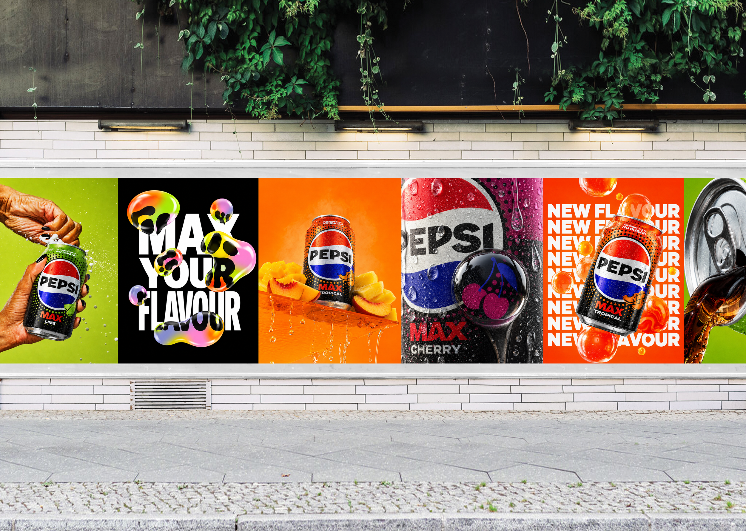
Concept 2 | Redefined Refreshment
This concept dials up refreshment through mouth watering spritz, dramatic condensation and tasty spills. Though the world is very colourful, it is connected through refreshment cues and bring you back to the sweet taste of Pepsi.
Concept 3 | Modernised Farmers Market
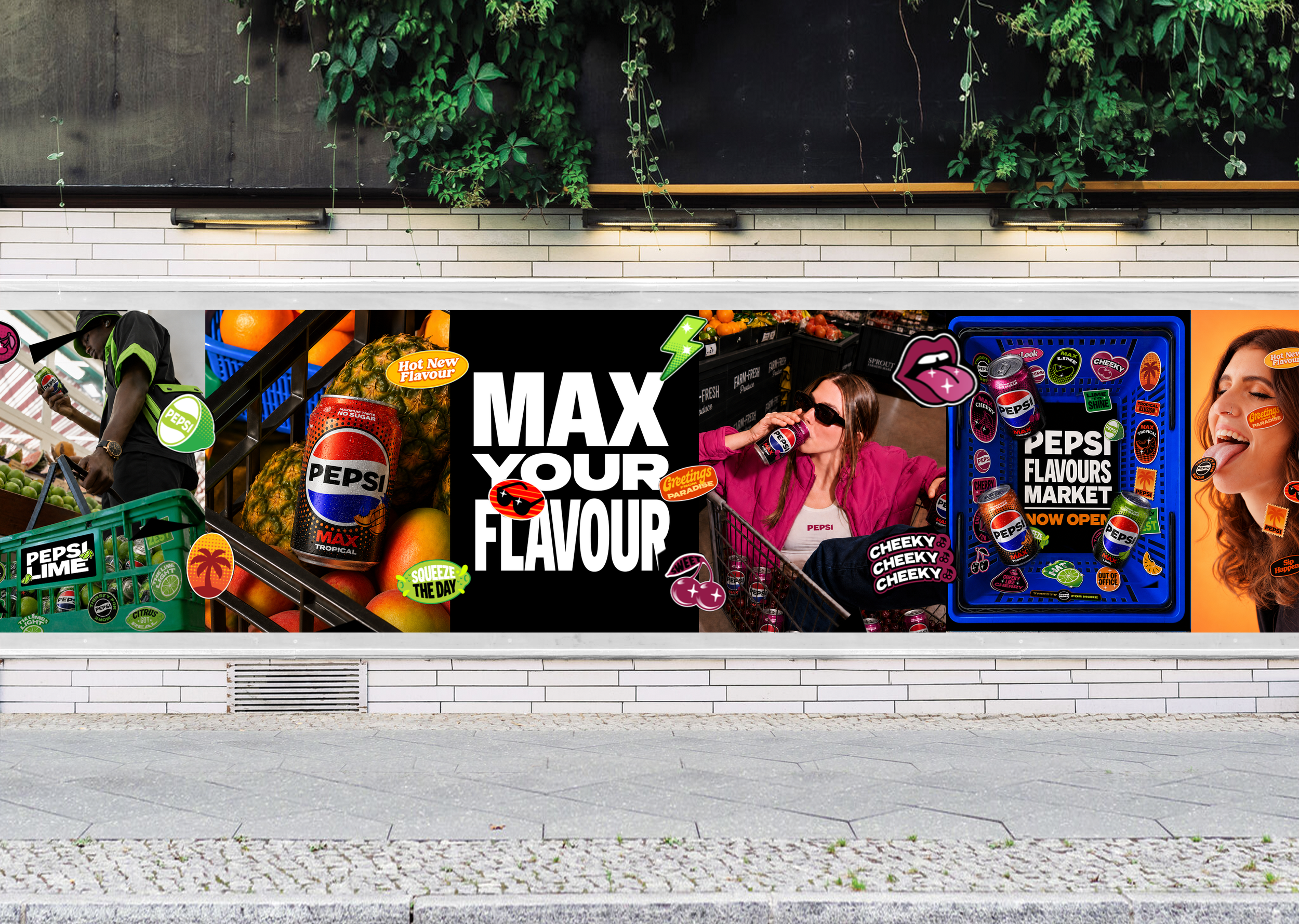
Taking inspiration from the fruit depiction on the cans and the connotation of fruit stickers, this route leans into British culture by using semiotics to relate the can flavours to the farmers market fruit. It is modernised through it’s art-direction and illustration style to make it feel undeniably Pepsi.
Chosen Concept
Senior stakeholders chose to go with option one as it felt most similar with the rest of the global flavours standards and most evergreen design. The execution of the stickers from concept 3 was liked and felt like it could be executed in a similar way that the global flavours key visuals are used so this was added in. The concept behind the refreshment concept was interesting and cues of that was brought into concept 1 subtly through spritz and ice cues. Next step was to develop the key visual and supporting assets.
Key Visual & Toolkit Development
Flavour Personality Strategy
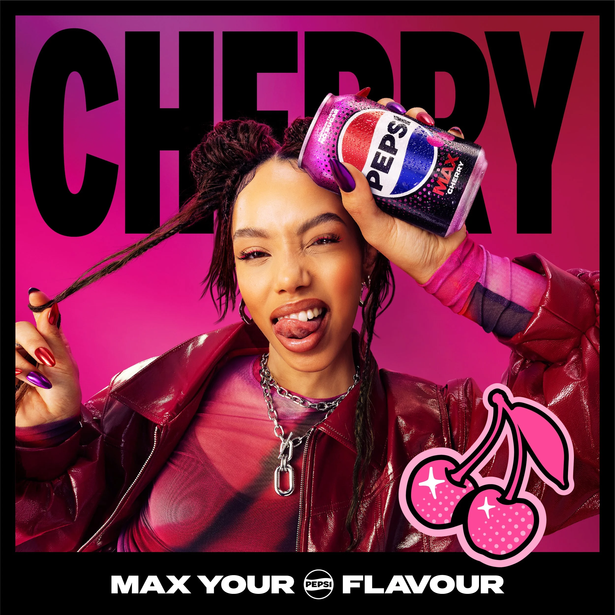
Fueling your main character moments. Cherry is bold and hypes the everyday.

Cherry

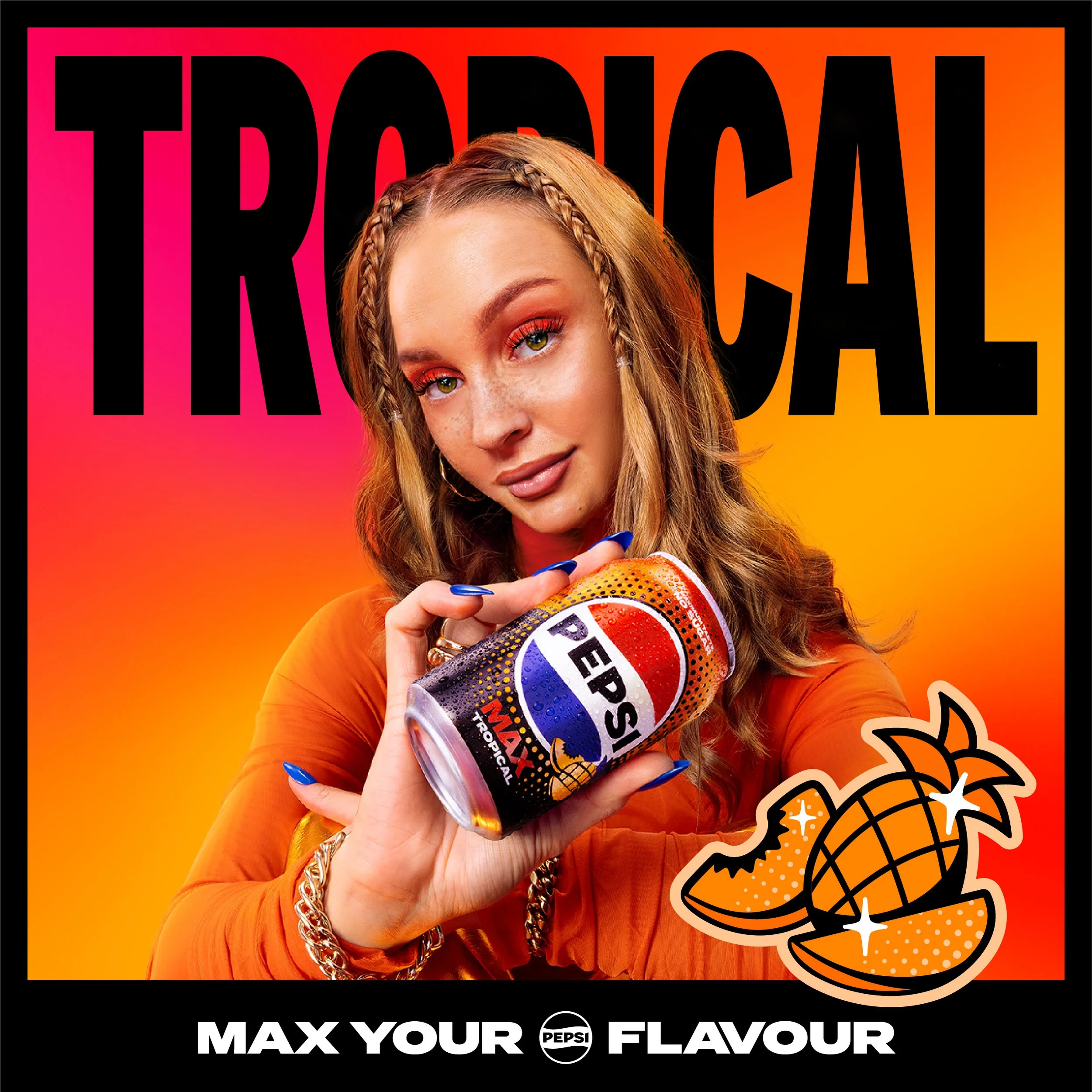
Tropical
Slow, relaxed and carefree. Tropical is a sun-soaked escape in every can.

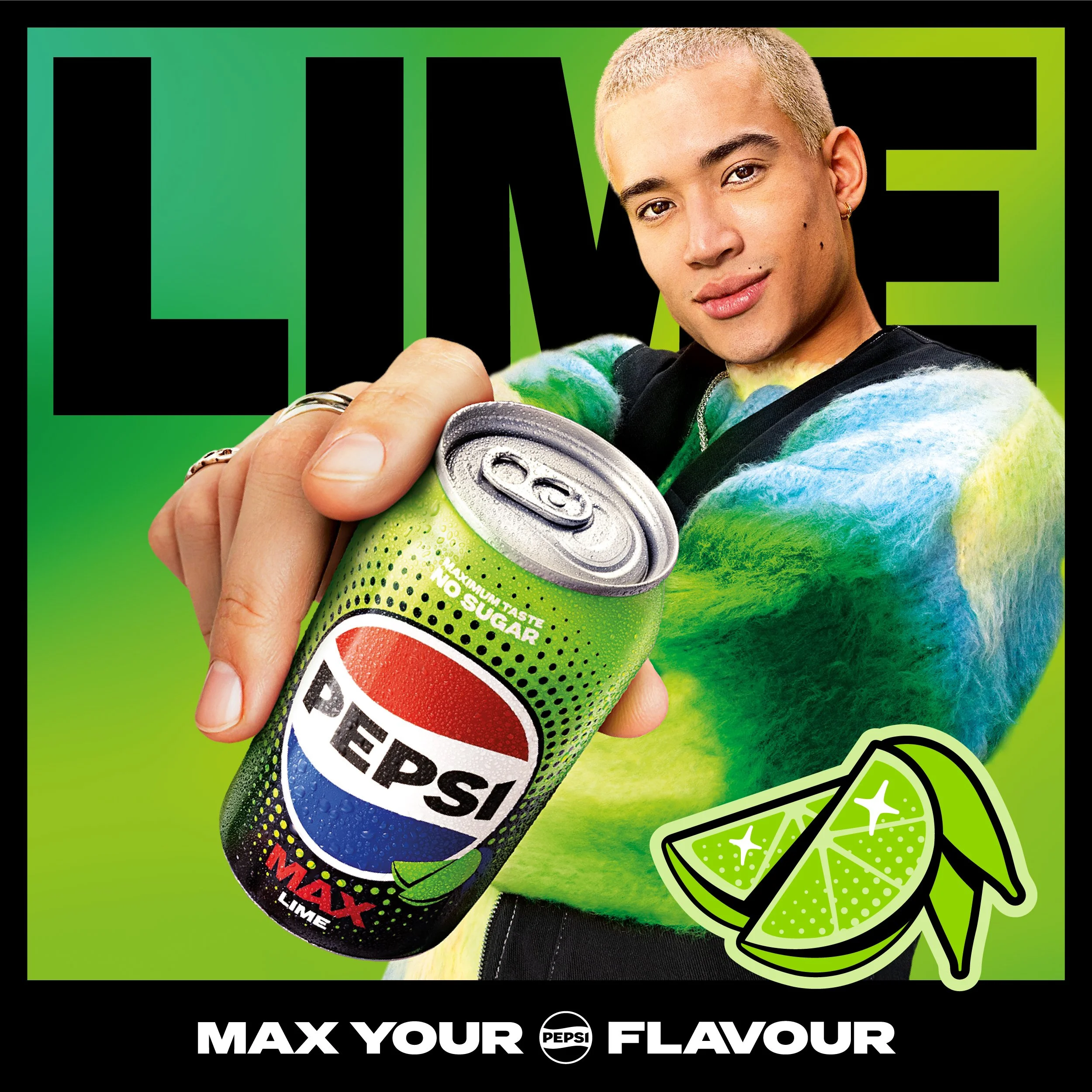
Lime
Crisp hits that helps your mood. Lime is sharp, zesty and instantly uplifting.
Asset Development
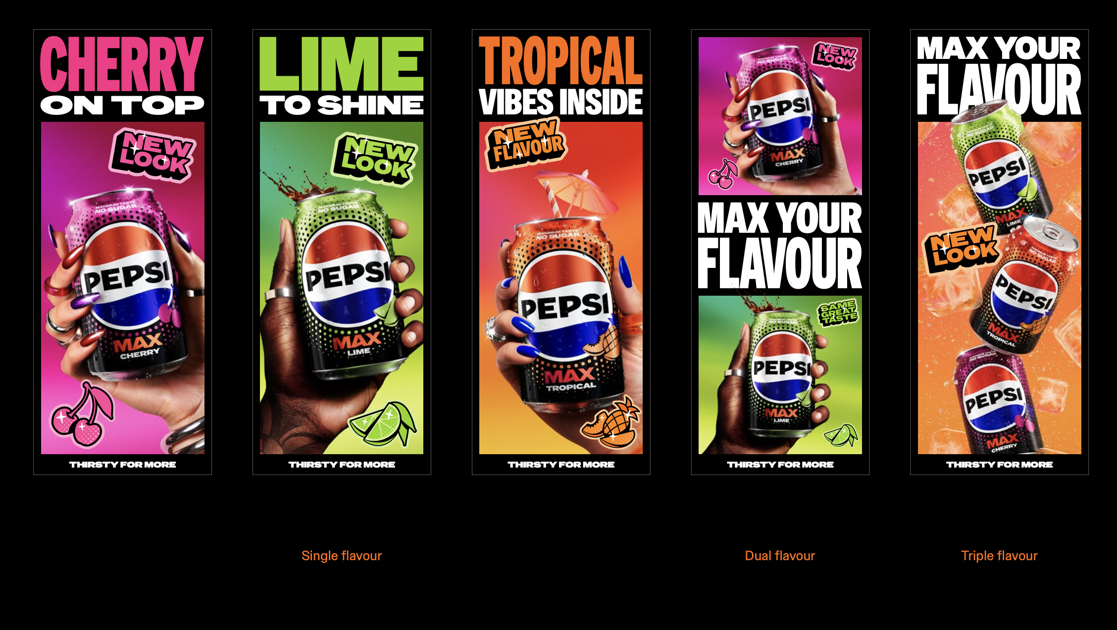
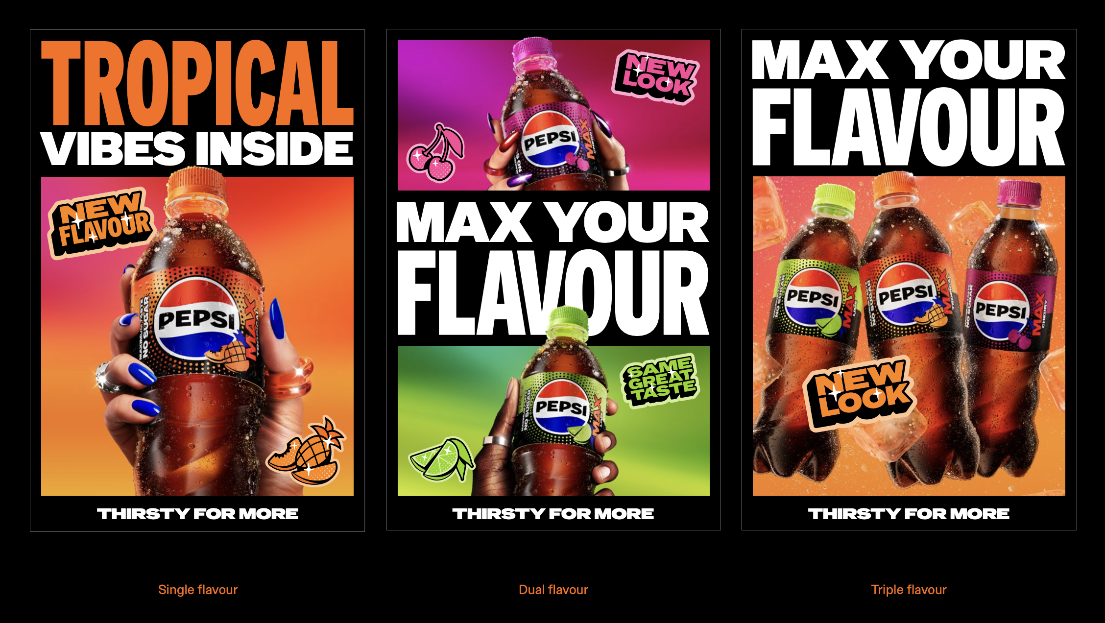
As this is the core toolkit for flavors, the key visual needed to be evergreen and extremely flexible between campaigns. Whether this is used for single flavour, dual flavour, triple flavour or if they swap for upcoming campaign headlines. For digital spaces with minimal motion such as digital banners, I developed the key visual with subtle accents which guided the viewer across the design.
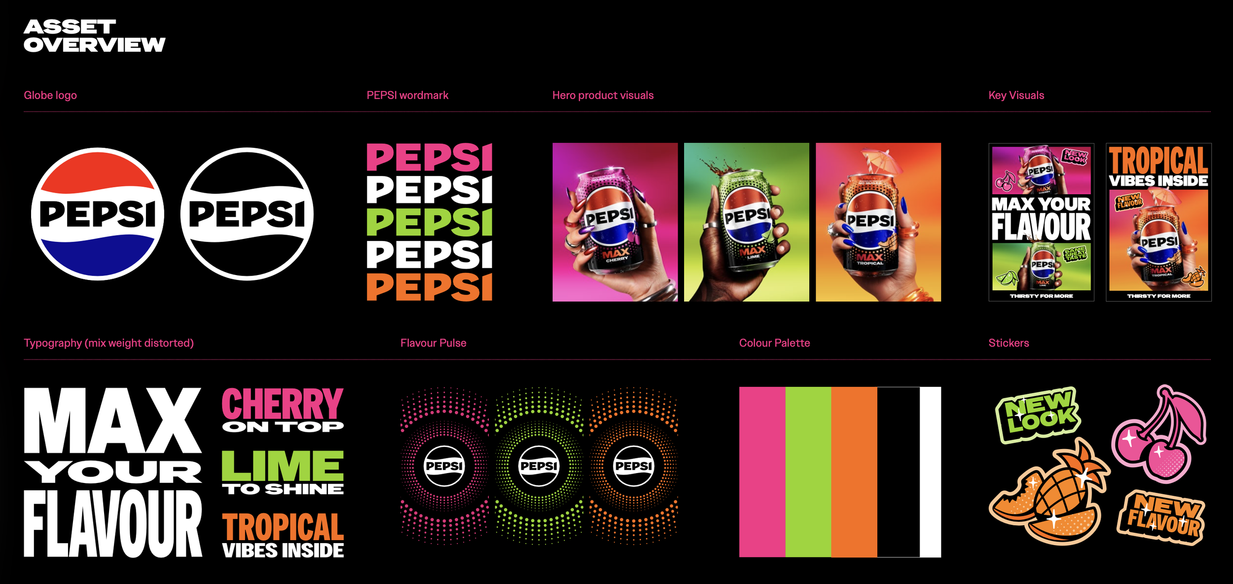
Key Visual Variants Structure
We developed and defined the kit of parts that will be used throughout the toolkit. These act as the building blocks towards any application of the designs. We worked with Rokabye to use a combination of 3D CGI, illustration, stock photography, and some ai adaptions to the photography in production to create the final assets.
Motion Development
In collaboration with Rokabye, we designed the storyboard and gave guidance to develop an adaptable piece that works in vertical and horizontal formats. The goal of the motion is to show the new packaging, the core messaging on pack and emphasise refreshment cues with spritz and ice. Type messaging would then be overlayed during the cola sequence depending on aspect ratio.
Lifestyle Development
In collaboration with NewGen, we guided the lifestyle direction by creating AI sketches using software like Gemini, Chat GPT and Firefly to help curate the vision of what we wanted from a photoshoot. We gave guidance on casting/props/material/lighting/outfits and with clear shot intent to speed the process and reduce costs with the agency.
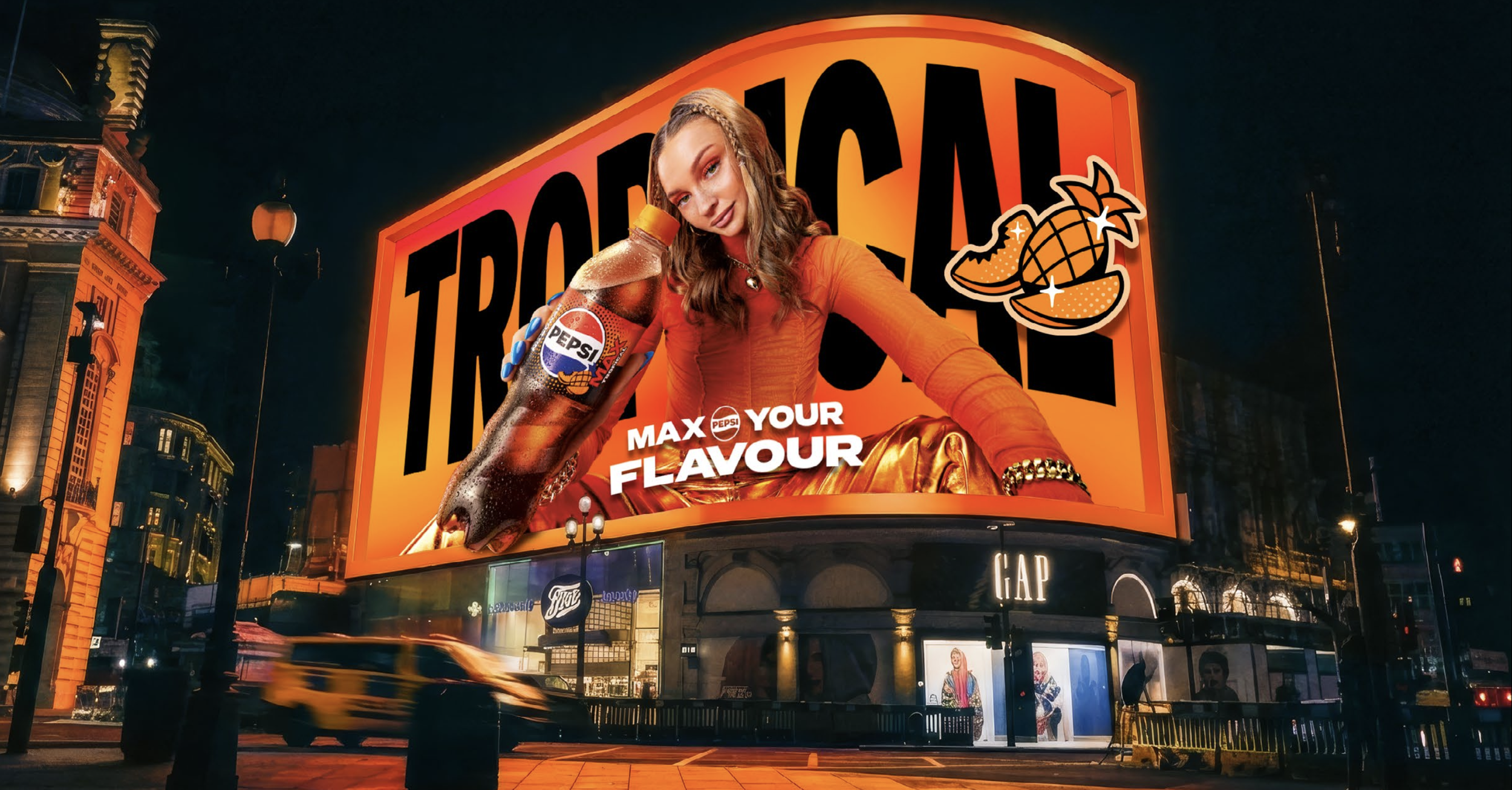
Final Lifestyle Key Visual Designs
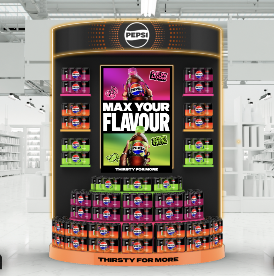
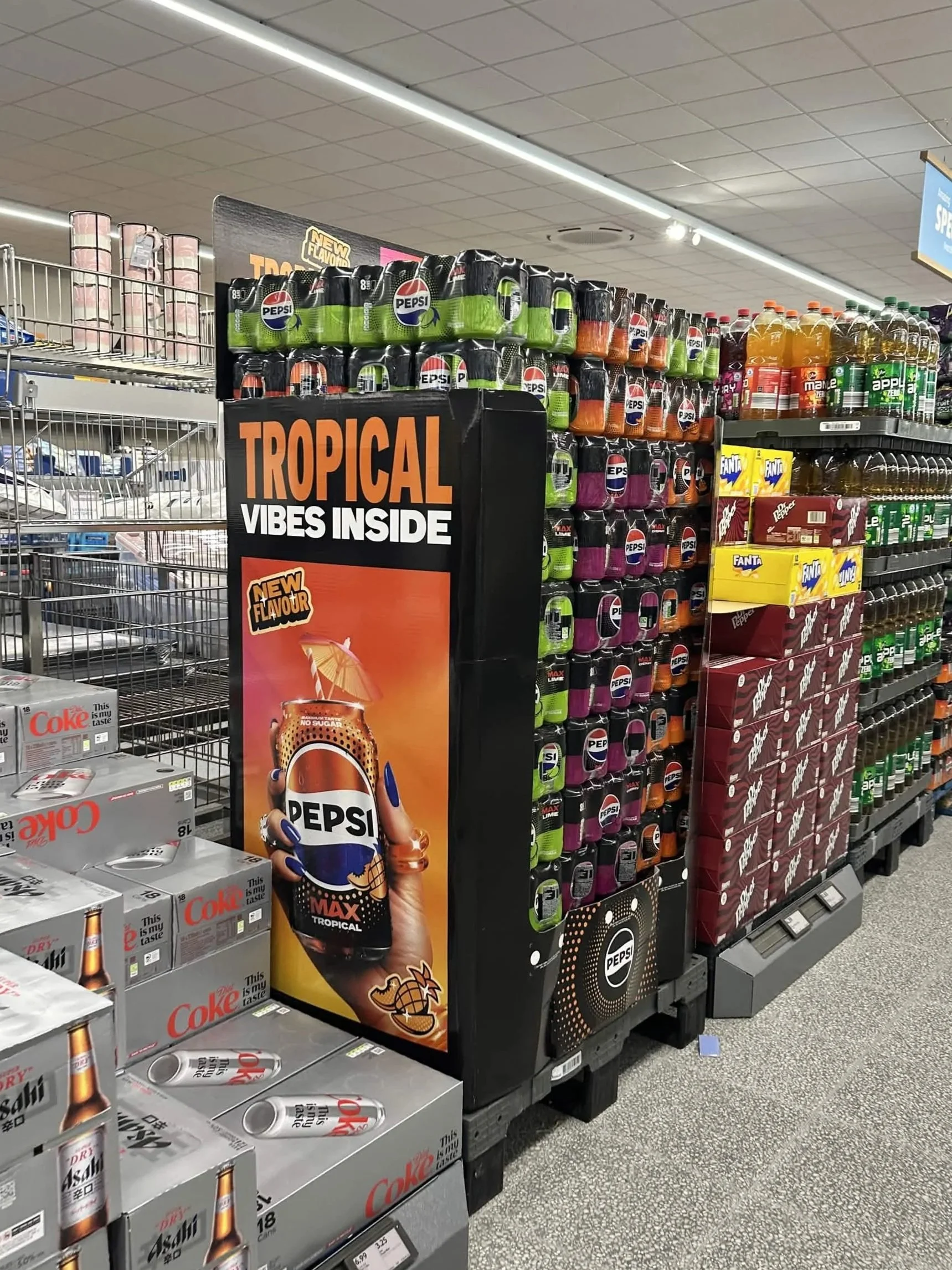
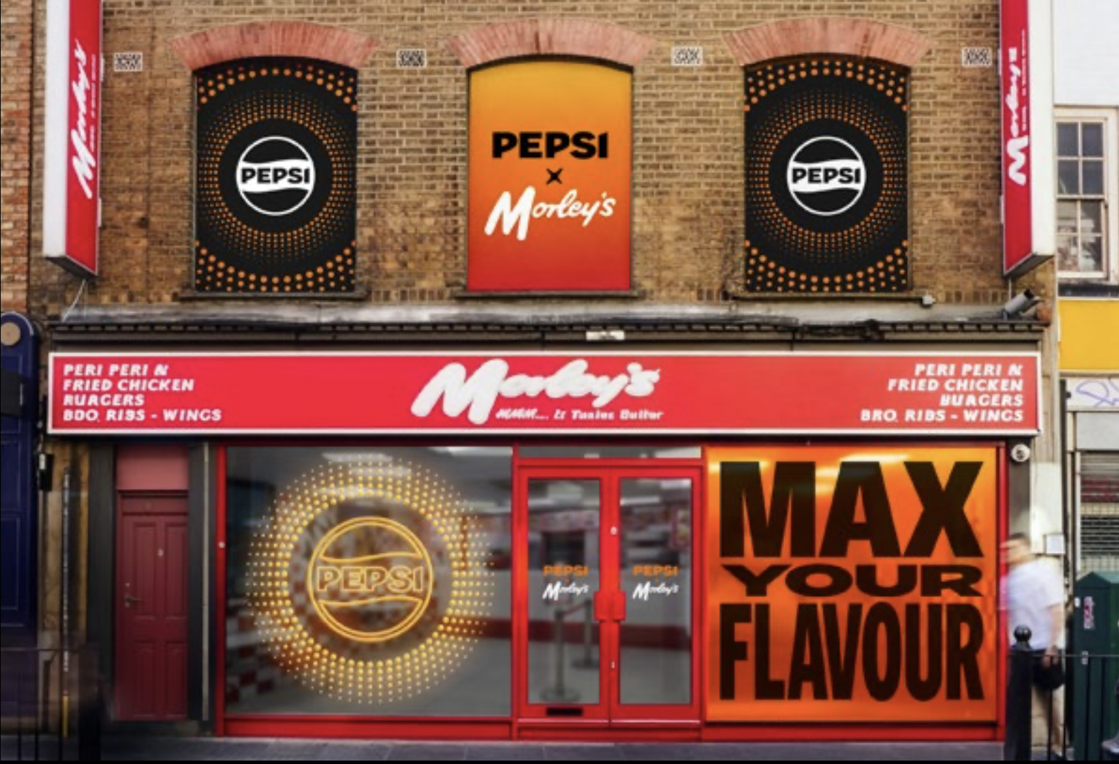
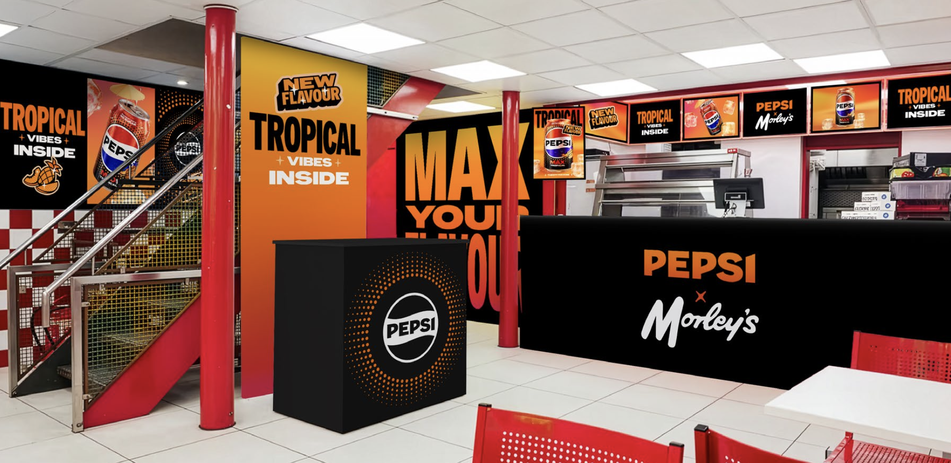
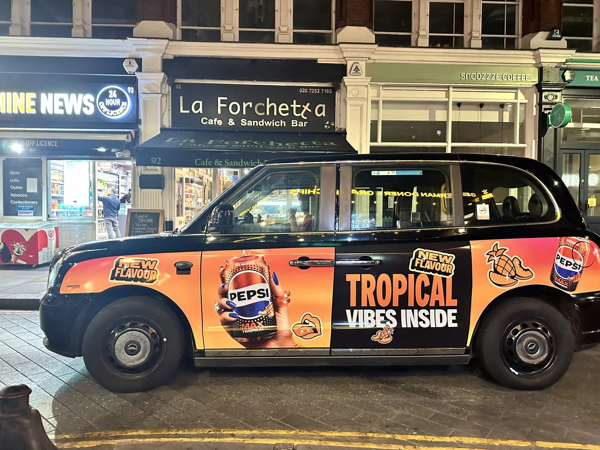
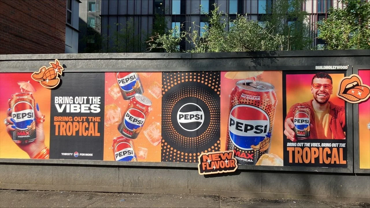
Experiential
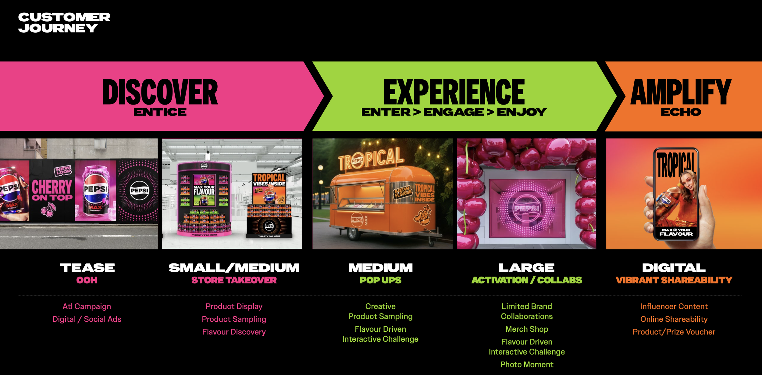
Toolkit Example Designs and Real Life Executions
Creative Team
Luke Gillman
Hayley Shore
Sam Wall
Rui Granjo
Cristina Yang
Aoife Hastings
Harry Popaditch
Tom Macpherson
Corinna Hutter
Kira Roberts
with initial packaging support from Red Dot Studios and KV/motion support from Rockabye.